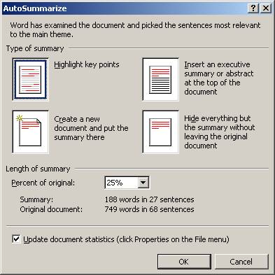
Put Functions Everywhere Where They Apply
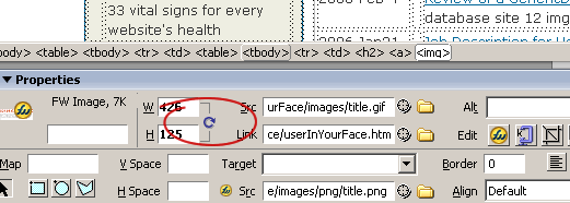
Although the lion's share of the techniques in this gallery will be text effects, text is almost always a substitute for a more powerful measure... one that usually entails writing a lot more code... providing more functionality... designing bolder solutions. So we'll start with an example from Macromedia Dreamweaver where they emphatically answer an age-old question in software development: where should this function go? The answer is everywhere. In the screen sample below I show four places where you can assign a style to an item. And there are more that I didn't get to! Gone are the days when it was acceptable to provide only one "invocation" or when designers had to justify the fact that redundancy is not foolish.
Instantaneous (Character-At-A-Time) Feedback
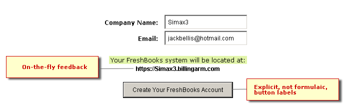
Explicit, Verbose Function Labels
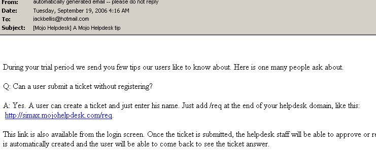
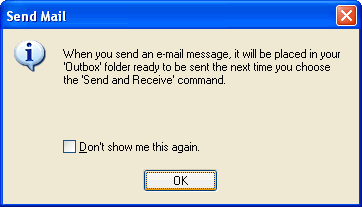
Email Tips
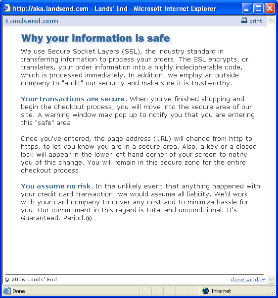
Don't Disable, Don't Hide... Explain
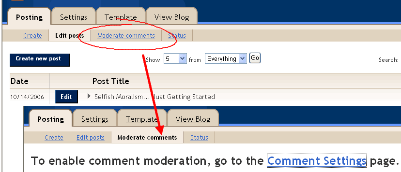
Advice Right on Menus
Page Advice
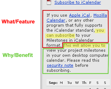
What Vs. Why
This point gets into pure techwriting. When explaining new
features, you must explain two distinct facts: what something
technically accomplishes and what the benefit ultimately is...
how it saves time (or effort, which translates to time, no?).
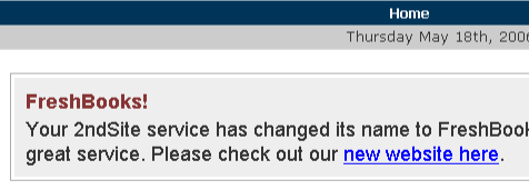
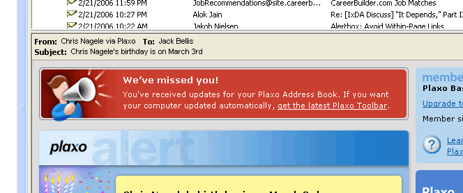
Announcements
Documenting "Not" Conditions
"We Have a Different Mental Model"
Explain What "Won't" Happen... and How To Do It If You Really Want To
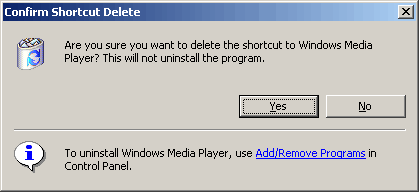
Explicit Capability Limits
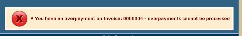
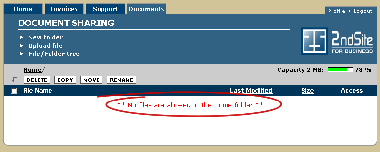
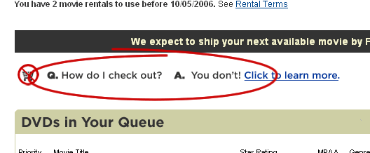
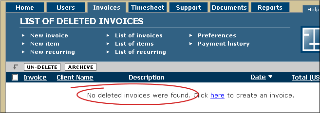
Unsuccessful Results
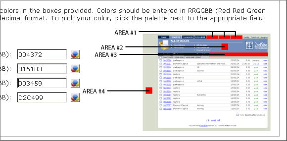
Describe Visual Items Visually, Not with Text
Animated Help
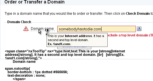
Field Information
Help Beside Every Field
Help Below Every Field
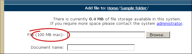
Special Requirements
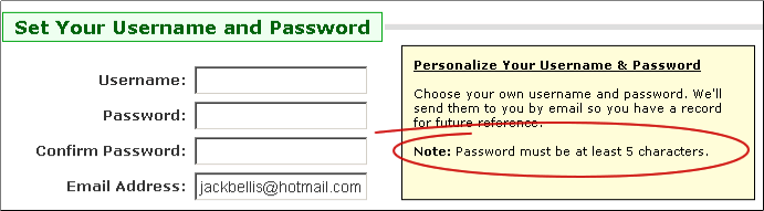
Limits
Field Help in a Rollover
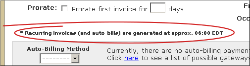
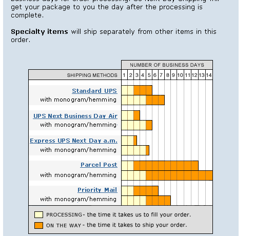
Function Information/Time Lags
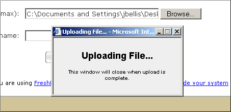
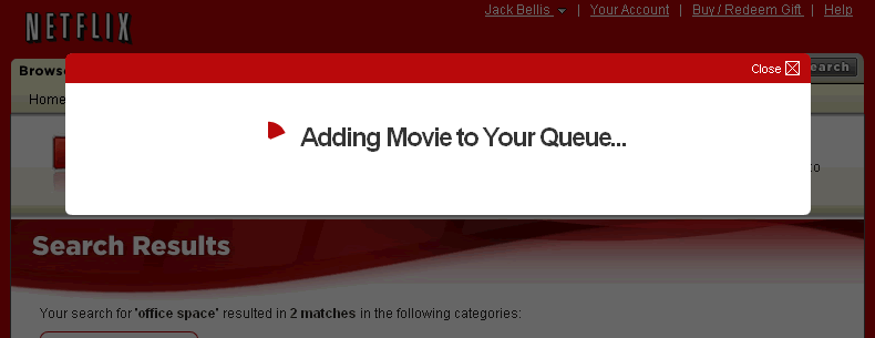
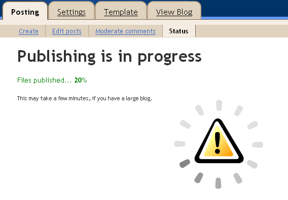
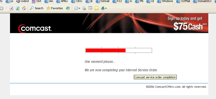
Prominent Feedback
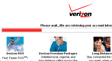
Show Progress Indicators, Not Just the Browser Status Bar
Menus in Order of Frequency
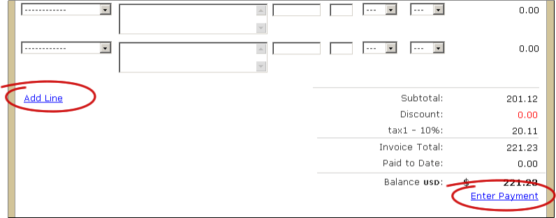
Functions Right at the Point of Need
Display the Whole State of Affairs
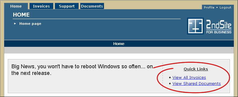
Link and Blurb
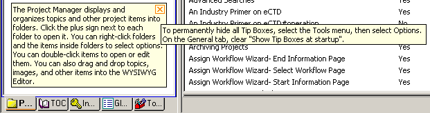
Just-On-Time Tips
Action/Technique Rollovers

Panel Introductions
Perfect Graphics
Detailed Message
How-To Messages
For a Mistaken Effort
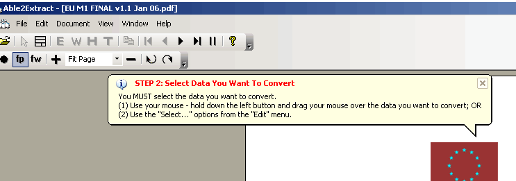
Sequential Steps
For Deferred Results
Explain Complex Options in Detail
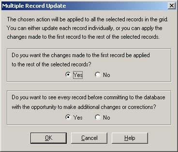
This message deals with one of the most powerful and complex techniques, bulk or en masse changes. I'd consider two somewhat trivial improvements: Bold captions in the two group box borders, and change "OK" to "Update" because of the impact of the ensuing actions.
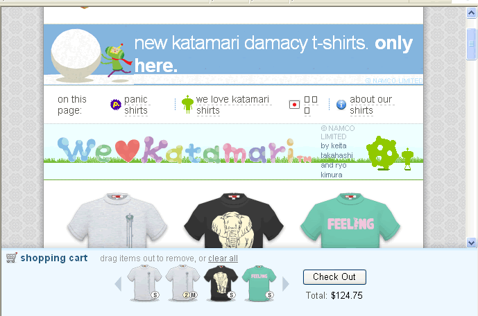
Show Choices Visually