Instant Usability... How Freshbooks.Com Turns Learners into Users on Every Page
Jack Bellis, May 20, 2006
Synopsis: The FreshBooks.com online business application is a model of techniques that can be used to make an interface self-training. It does this through excellent user interface design (both interaction and visuals) and a veritable encyclopedia of methods for embedding instruction right into the interface. This article enumerates and shows each technique.
I recently came upon an online application, FreshBooks.com, that absolutely epitomizes how to make a system self-training. In my view of the user experience (UX) world, usability has two halves: learnability, which is fairly self-explanatory, and facility, by which I mean the speed of use once learned. So the example of FreshBooks represents what might, by some accounting, be roughly half of the solution to the usability puzzle. In this article I'll dissect their design and explain how each technique contributes to the overall effect.
Although anyone in the UX field might enjoy this article, it is especially targeted to new students of software development because your knowledge of usability is the key to the great software yet to be created.
What Is FreshBooks?
FreshBooks is an online invoicing application, but it includes a growing suite of other tools such as timesheets and customer support tickets. Some of you might know of it from its previous domain name, SecondSite.biz. I think I learned about it on AListApart.com (a technology magazine for web design issues) so it’s probably popular with freelancers in the software world.
Constantine and Lockwood's List
I've been on the lookout for exemplary web apps, as opposed to content-centric sites, for years now, as models of design solutions, so I gladly clicked that advertising link in AListApart. After just a few minutes using its free trial, I found FreshBooks to be a model of the techniques for eliminating the need for advance training of a software application. An article by Larry Constantine & Lucy Lockwood, Instructive Interaction: Making Innovative Interfaces Self-Teaching does a comprehensive job of defining the techniques. The article is from 2002 but still perfectly current and well worth reading. On page 6 they zero in on what they call “instructive interaction,” items such as the following:
- Balloon Tips
- Embedded Prompts
- Instructive Animation
- Progressive Disclosure
- Start Highlighting… and so on.
The article covers all of the ingredients that make software self-training, not just informational techniques but also the broader values of forgiveness, undo support, explorability, and so on. Although FreshBooks clearly answers those higher callings—I’ve heard them called “lofty goals”—this article will focus on instructional techniques and explict interaction design, showing exactly how FreshBooks employs them.
If you've made it this far, I have a free
gift for the first 10 visitors who
reply. (Still available.) If you know
anyone who's learning to read, email
me and I'll send you a free copy
of a kid's book I wrote that has just
been printed (February 14th, 2007). Please
include "Poopy Phonics" in
the subject line so I have a chance of
recovering it if it goes to my spam folder.
For smart mouths everywhere, the book
is PoopyPhonics(.com). No
strings attached, but if you like it,
consider posting a review to Amazon.com. —Thanks,
Jack
—No spam, no emails,
no private info given out—
|
|
|
The Techniques
Very few of the techniques are particularly groundbreaking. They just happen to be used well and all in one place. FreshBooks has a completely free trial mode, so I encourage you to give it a try. If I’m not right about its usability, let me know. I found a few—very few—usability imperfections, but they're not significant enough to even bother with in this article. (If you're really curious and want to see how good an eye you have for usability, send me an email with at least one flaw that you find, and I'll send you back my list.) The techniques that follow have been grouped a little bit but otherwise are in the order in which they were discovered.
1. Sandbox
In fact that free trial mode that I mentioned is the first instructional technique… a no-risk environment in which to play. It has just enough sample data, so you can use most features without doing your own setup of every single item.
2. Fly-In Field Help
The following image shows the technique that hooked me almost from the start. On their initial setup page, the help flies in from the right as you anchor the cursor in a section:
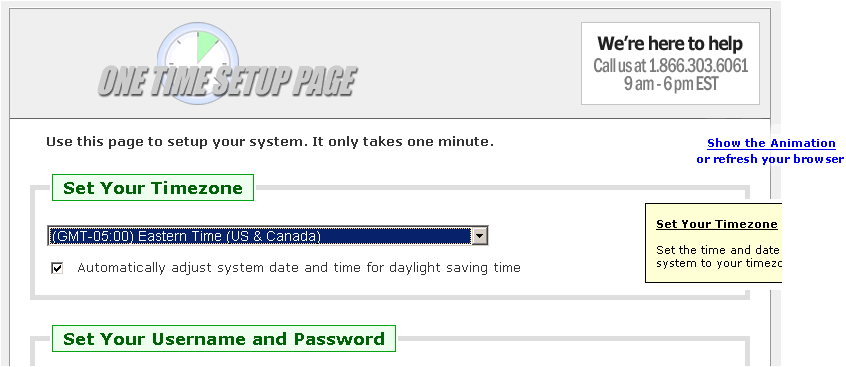
As you anchor the cursor in each field, that field's help appears. Now we all know (don't we?) that animation is generally frowned upon... but here it's pure state-of-the art... it works for the teacher, like a song-and-dance supporting a tough math or science lesson. (Did anyone else have Mr. Issod for chemistry?) I've been recommending fixed-in-place, embedded help for years now but it's still easily ignored. The fly-in technique gives it impact.
When looking back through FreshBooks to get a screen capture of the fly-in help, I couldn’t find it. That’s because it’s used very sparingly… only on the first pass through the account setup wizard. When you later modify account info, there's no distracting motion. So the lesson of using animation conservatively is not lost on the Freshbooks designers… they know it’s not something to overuse. Prior to writing this story, I spoke with the folks at FreshBooks and they told me that the animated help vindicated itself quite clearly in the support department, through the reduced call volume.
3. Support Phone Number (With Time Zone)
When I’m done this article, I want to have a veritable functional spec of self-training techniques, so it’s not trivial or even tangential that a phone number, a “voice link,” is prominently displayed. Self-training doesn’t mean “never has a problem.” The availability of a phone number is something I look for on the website of any distance vendor with whom I’m considering doing business. I’ll even make a preemptive phone call to judge their accessibility if it’s an important purchase.
4. On-the-Fly Feedback
Going back one step, even in the page where you initially identify your trial account, two things show up that start to really distinguish the site's usability. First, as you type your company name, the prompt on the page updates interactively—letter by letter—to tell you the URL at which your system can be accessed. I call this on-the-fly feedback.
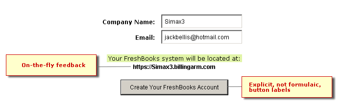
I stopped to consider whether this is an instructional technique, even with a liberal interpretation. Or is it simply good interaction design? After all, couldn’t a dialog box, after saving the form, be just as instructional? No. The reason it is instructional is that you see the effect of Company Name without waiting until it's too late to change your mind. You know by seeing the URL built that Company Name is not simply a descriptive field but also a unique identifier… and you know not to make it so long that you might forget it after your bookmark or favorite has been deleted. OK, it’s good interaction design, too.
5. Explicit Button Labels
Most systems use formulaic button labels such as Submit or OK, even when they’re not as instructive, because they're built into the tools that make the forms. By putting four words on the "Create..." button above, there’s no question what the result is. It even reinforces the user’s subsequent language. Imagine a later conversation… “Did you create a FreshBooks account?” The user doesn’t have to recall a “page name,” such as Create FreshBooks Account, to confirm if they created an account.
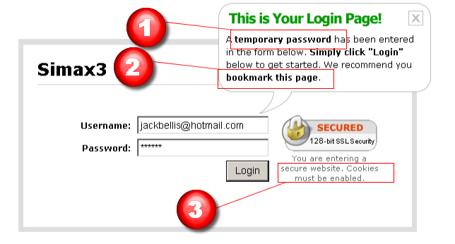
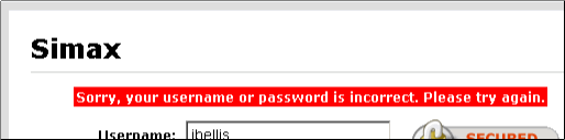
6. Explain, Advise, Inform
The following image shows the login page. Although logging in is a simple matter on return visits, it has important peculiarities in this particular scenario, for two reasons: 1) it is a trial system, 2) the web was never designed for applications. To deal with these complexities, there are three types of information provided on this page, above and beyond the actual prompts:
- An explanation of the temporary login. The user needs to understand what’s going on and how to use it.
- Advice about saving a bookmark. It’s advice because performing it is optional.
- Information about the requirement for cookies.
Too Much Wording? By this time, perhaps you're asking, "When is more text too much?" I'm glad you asked. The answer is that it's a balancing act and requires judgment. If you make the right judgment, you're called an interaction designer, or Ix, Ux, IA, choose whatever flavor you feel is appropritate. If you make the wrong judgment, you're probably something else, not that there's anything wrong with that.
7. Can't-Miss Error Formatting
The following figure shows the formatting for "inline" errors, meaning those that appear right in the problem page or "context." I've seen more elegant formats, but none more noticeable.
In fact maybe this is a good time to mention the overall look and feel of the site. They could have used a warning icon or a framed box, or a soft red-to-white gradient background but they didn't. The whole look of FreshBooks is a slightly spartan, "plain HTML" decor, with some nice effects sprinkled on top. Web designer Luke W., http://www.lukew.com, points out that a site ends up having a visual "personality" that is more than the sum of its graphical parts. If you've ever designed a site from a blank page and found yourself adding unplanned graphical elements to it, you can appreciate this phenomenon; you end up saying, wow, I didn't really set out to make it look bold/stark/elegant/intimidating/warm... but that's how it ended up. The personality of FreshBooks is clean, crisp, no-nonsense, inviting... and to those in the business, this implies speed. Speed is good.
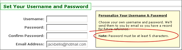
8. Password Explanation
This next technique is a literal, special case of providing information. When users are creating their passwords, provide an explanation of minimum password requirements:
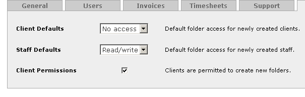
9. Announcements Area
Provide an area at the top of the home page for announcements from the system owner. FB calls it News:
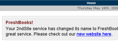
I've heard the terms "bulletin board," "messages," and "notices," but I like"Announcements." It's indicative of being broadcast to everyone. An announcements feature enables you to augment training over the course of time. If your home page has a lot of functionality, consider making it collapsible but only for the session or until a new announcement. FreshBooks has separate news functions for your clients and staff.
10. Intro Panels
Now we start to get into the "heavy lifting" if you will allow that embedded instruction entails real work. The following figure shows what I call an intro panel:
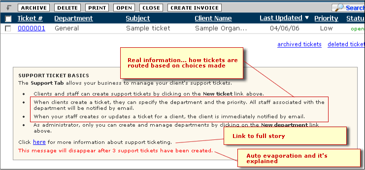
Although I've probably seen lots of examples building up to this technique, the first thorough use of it that I recall is in Salesforce.com. The FreshBooks model really nails it. Notice it includes the following key features:
- Real information, not just instructions on how to click a button or complete a form. (That's been the bane of software techwriting for the last 15 years. As interfaces became graphical, most writing fell into a trap where it described the interface instead of how the system works.) Notice the second and third bullets tell you how tickets work! Even the first bullet, which would be gratuitous if it simply explained clicking New Ticket, actually tells you that it's a feature for your clients.
- The link to more information is important to have.
- Both the functionality of having the intro panel disappear and the explanation of when it does so are important.
11. Choose Clarity Over Consistency
The following figure shows a simple interaction design choice, but a subtle one. Given the visual layout that they're using in this example, many teams would have opted for a dropdown list with Yes/No choices for the third item, rationalizing that it looks more consistent. Instead they used the more appropriate control from an interaction and comprehension point of view... a checkbox.
What do I mean by "comprehension?" I mean that the "message" of the checkbox goes right from the user's eyes to the final destination in the brain without slowing down anywhere. It says "I'm an on-off switch." The FB designers understood that visual consistency is not the Mother of All Design Rules: when the limiting factor is training, it is more important to honor functionality than aesthetic consistency.
12. Legends Right on the Page
The following figure shows how legends are placed right on the page where they are used as cues:
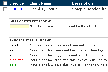
The Support Ticket Legend is actually from an unrelated page but I added it to show how color-coding is indicated. If space is at a premium, put the legend in an area that can be hidden once the user values space more than training.
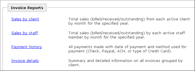
13. Link-and-Blurb "Menus"
Perhaps you can tell me a more sophisticated name for it, but the following figure shows what I call a link-and-blurb layout. It's a list of reports, and in contrast to a typical Win/Mac system where the reports might be on a dropdown menu of terse names, this page shows descriptions. Notice helpful details such as the words "active client" and "grouped by client." As a report list grows, these are key values provided by this type of menu.
14. Catch-All Choices
The following figure shows that FB makes reports available in both categorical and all-in-one lists. There's an All Reports link and individual category links such as Document Reports:
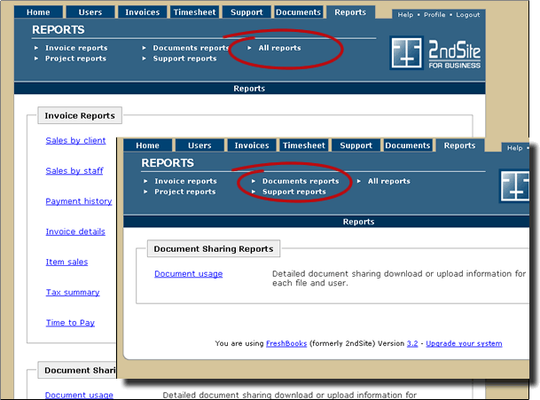
There are several subtly different principles involved in this one example but the first one concerns the availability of a catch-all listing for all reports. By providing a unified list, the user gets at least two advantages. First, you can see at a glance the scope of reports... a gauge of the system's breadth. Second, and more importantly, if your mental model doesn't match that of the person who made the groupings, you can still find the report you want.
15. Two Paths to Functions
The second principle in the reports menu is the notion of having multiple links to a single function. I use the analogy of rooms in a building... it's often helpful to have doors on two sides of a room, so why shouldn't the same apply to software functions?
16. Ubiquitous Linking
I'm not sure what to call this one, so I'll start the bidding at "ubiquitous linking," and ask the audience to vote on it (as in email me). Notice in the following figure that something as un-functional as the version number is linked:
Of course it's linked to a list of that version's features. The principle is that everything that has significant information associated with it should be linked... to that information. What could be more natural? Yes, as more things are linked, other design issues will arise, but that's not my fault is it?
What? No More Blue Underlining? If you go to Macromedia.com's home page, you'll notice that underlining links ain't what it used to be. On pages that are primarily functionality (as opposed to text) everything might eventually be a link and the ol' blue underlining will be a thing of the past. I recommend even today, that visited text links in prose should probably turn the same color as the text, but still be underlined.
17. Visually Efficient Information
The following figure shows FB's upgrade page, which is now a fairly standard layout for a comparison chart:
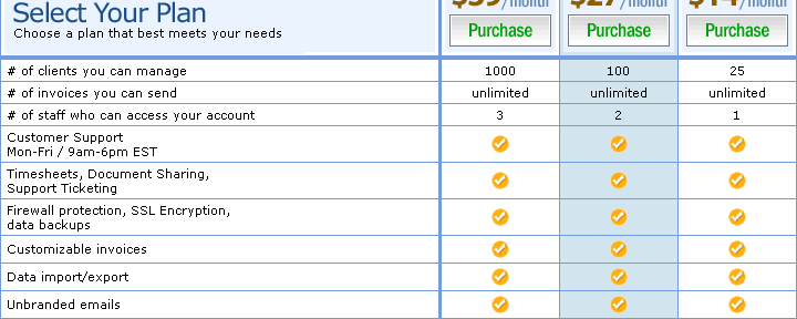
Although it's fairly standard, it's by no means universal. (Here's an example of a page that doesn't do it right.) The key is that your eye can discern the differences in the plans in a single action. I'm guessing they get only the barest minimum of calls asking to clarify their rates. The use of icons instead of words for the "yes" items is key. This is the subject matter of a book by Edward Tufte entitled the Visual Display of Quantitative Information. If he has a name for this technique of reducing parallel information to a single glance, let me know. (I haven't read the book... I only looked at the pictures.)
The chart above also has a subtle interaction technique: when you point the mouse at one of the purchase buttons, the corresponding whole column turns blue, as shown by the second column. This reinforces that you are choosing the column you intend. This might be a tiny morsel of usability but that doesn't make it a foregone conclusion. Someone had to have that idea and value it enough to ask for it; someone else had to write or find the code. In today's software development world, unfortunately almost all such code must be written over and over again... it doesn't just come already organized in a boileplate or framework project.
The effect, though bordering on frivolous (by some shop's low UI standards), is one of many, many feedback mechanisms that accumulate into a whole that is more than the sum of its parts. I call this particular category of technique "compelling interaction," and it's one of my triumvirate of home page design.
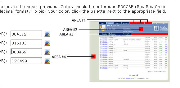
18. Display Visuals with Visuals, not Text
The following figure shows what would, in most other systems, be a set of sentences describing regions of the screen. At best the image shown below would be relegated to a help file. In FB it's right in the interface:
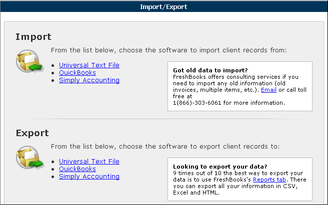
19. Put Advice on Menus
When a menu needs more than just an explanation, put the related information right there. The following figure shows "advice" on importing and "information" on exporting. The note about using Reports as an export method is applicable to a lot of system lately.
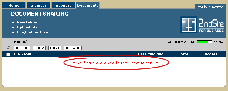
20. Explain What Can't Be Done
As interfaces become more powerful, self-evident, and bulletproof, one of the most important things remaining to help users with is explaining what can't be done... what the system does not support. The following message in the documents list does exactly this:
There's a broader, common theme surrounding this "can't be done" issue. In general look for things that users must be told in the negative, including things they might intuitively expect, but are not the case. Here's another example, explaining that overpayments are not supported:
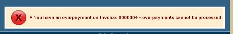
The wording is subtly but significantly more informative than a typical "exception message" such as "Payment is greater than amount invoiced." It identifies a feature that is not supported. This is a level of information that many organizations are embarrased to offer... and simply end up paying for in training and support costs.
21. Menus in Order of Frequency
The following figure shows what FB looks like when your clients log in. For instance, what if I used FB to invoice Microsoft $54 billion for all the time I've lost rebooting Windows from '92 to 2003 (It's much better now, isn't it?... Kids don't know how good they have it). When Bill logs into FB, he sees this:
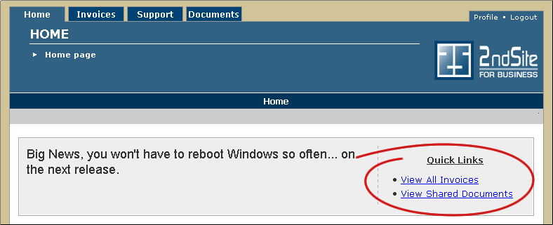
The two links on the right are also on the Invoices and Documents tabs, but because they're the most likely options that a client would look at, they're right on the home page. Systems have called these lists many things over the years, hotlists, quick picks, and so on. The name isn't as important as the idea: it is a menu in order of frequency of use rather than the traditional menu order, functional category. On a content centric site, it could be called popularity.
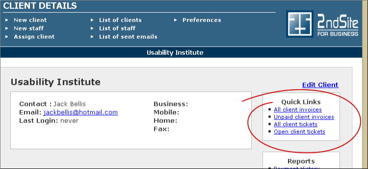
The next figure shows the same quick links feature from the Client page. This page really drives home the notion that the links are to disparate functions that would not even be on similar menus. You could make a case that this is slightly, but distinctly different than "frequency." Instead of being related functionally, they are related by data... the customer:
22. Put Links Right in the Interaction Flow
The following figure shows a link to preview an anouncement, placed right in the "saved" confirmation message:
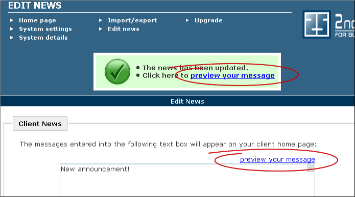
This is yet another example where links to a single function are in multiple places. In this particular case, the goal is to provide the pertinent functionality right at the place where the user's thought process and eyes are going. In the development world, where any form of redundancy is frowned upon—and justifiably so—such a design is not easily "sold" to the technical team. But here, a clear choice has been made to put the user experience first. (In an ideal development world, the two visible links might invisibly invoke a shared reference so that no risk of redundancy is actually introduced.)
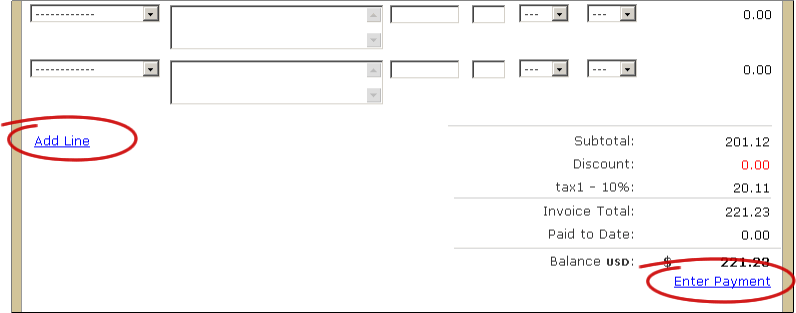
The next figure shows the same principle in the invoice page. The Add Line link is right where you need another line added, and the Enter Payment link is at the "bottom line" in case you are entering an invoice at the time you receive funds, instead of in advance:
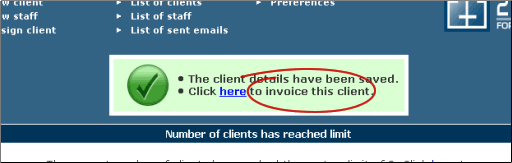
And one last example... after adding a client, there's a link to invoice them:
23. Talk Casually... Invent Words?
Occasionally I'll get into a discussion with someone as to whether "uncheck" is a word. Well, let me tell you, it is now, whether you find it in Dictionary.com or not.
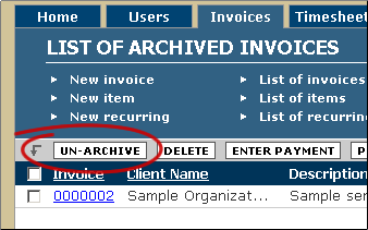
The FB interface deals with this issue too, and labels a button "Un-Archive" because that's the clearest way to label the function. I'd say that I authorize you to invent words if you have to, but that's not really accurate. If a term is in common use to communicate, then it is already a word. Trust me on this, wudja?
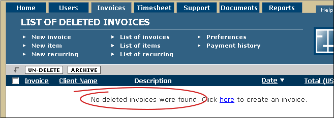
24. Explicit Empty Messages
When lists are empty, say so explicitly as shown in the following message:
25. Warn Before, Not After
Warnings aren't warnings if they are provided after a problem occurs. The following figure shows a good way to put a file size limit right into a field label:
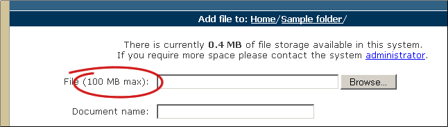
The "0.4 MB" message is also another example of the same concept. (It appears to be a discrepancy but it is because the account is a trial account.
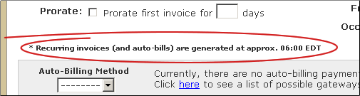
26. Explain Time Lags
The following figure shows an explanation of an automated process that occurs at what would otherwise be a mysterious time. Any form of delay must be explained to users or your application will be extremely hard to understand and you will never be able to get off the support phone.
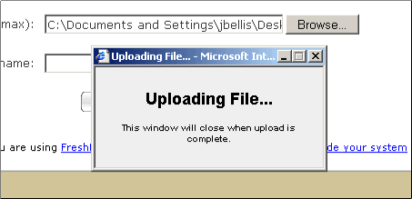
27. Explicit Progress Messages
Here's a more important timing item. One of the most troublesome interaction design weaknesses of creating applications in a web browser is feedback when processes take more than an instant. The default behavior of the browser is to show the progress in the Windows status bar, which is so subtle as to wreak havoc. The following figure shows that FB has a custom solution to present a prominent message right in the middle of the screen:
In my 1997 book, "Computers Stink" I pronounced, "When the user does not have control, announce it prominently" and FB answers the call. If you're really curious, see page 54 of the 650K PDF. I never really published the book, though I did have 100 crude copies produced and you might get one online if you want to be a collector. It's probably decent reading, with a lot of good anecdotes from my years installing point-of-sale systems. And a lot of the usability rants are still applicable 9 years later, though folks like those at FreshBooks are making strides. We're gettin' there folks. Computers Stink is listed on my Resources Page.
28. Optimize Repetitive Processes
The following figure shows a button that has been added particularly to support repetitive processes:
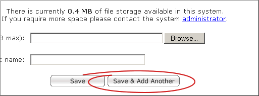
Is this just another case of putting interactions in the right place? No. It's an entirely new interaction that has been added to eliminate one "measly, little" user action. For administrative or occasional functions, one click is not a big deal. But for repetitive functions, also called "transactions" or "heads-down" functions, every click and keystroke matters... to all of us users.
They're Only "Little Things" If You Do Them!
That concludes our instant learning tour of Freshbooks.com. I hope you've learned a few things.
We've shown just how many "little things"—our 28 are just a sampling—add up to "instructive interaction." And there are some pretty nit-pickin' items in this list, eh? (Did I mention that FB is out of Ontario, Canada?) But as I've observed over the years, they're only little things if you do them. If you don't, they're big things. They're big enough to mean the difference between online success and failure.
Let's take that last item, optimizing repetitive processes, as an example. When you are designing interfaces, which of the following two questions are you more likely to be asking yourself or your team?
- "Why should we do this? After all, it will only save the user one click/keystroke."
-or-
- "Is there a good way we can save the user one more click/keystroke?"
If you're asking the first question, beware: there are companies like FreshBooks out there, one website away, providing a higher level of service and ready to take your customers as fast as you can say "Free Trial." As for me, I have to go add a lot of these things to my Function Tree.
|