|
|
|

Redesign of www.travelrack.co.za
A Brochure Download Site for Travel
The Home Page, Before
TravelRack is a page that enables you to download travel brochures
in a manner equivalent to E-books in that it requires the use of
a proprietary, though free, viewer program. It raises the issue
of whether the need for the viewer will deter some visitors, but
for this review we're only addressing one issue: redesigning the
instructional nature of the home page. Here's what it looks like
before my suggestions (the yellow highlights are mine):
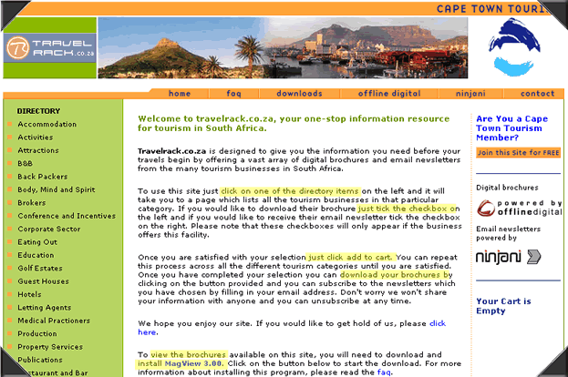
Notice that there's a 6-step procedure woven into small text prose.
Techwriters out there are turning in our cubicles at the mere mention
of it.
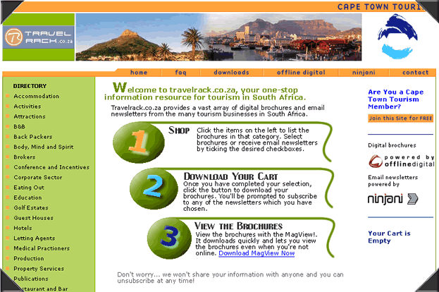
After... Here's Our Idea for the Page:
Our solution is the venerable link-and-blurb, well they're not
really links, just headings but the point is the same. And we deliberately
cheat, making it look like three steps.
Now we're not representing ourselves as graphic artists...
this is just a super-quick mockup of the use of space and general
notion that we think you should aim for. I'm sure an artist
can come up with a better motif for the three sections. Browse
the web and you'll find examples. Here's
one we found. And we'd probably add a "Details"
link at the end of each blurb, or just make sure that the sub
pages do the job. The only step that should really need verbatim
instructions is #3 since there's no page to hold 'em by the
hand.
|