|
|
|
E-Commerce Shootout
March 2000
This installment of UIBA (don't ask us how it's
pronounced) is not about how well a system can be used
but whether its design encourages its use at all. And our material
is not hypothetical in any form... the "before" is
LendingTree.com and the "after" is E-Loan.com. Usually,
by the time a review like this is written, the sites in question
have changed, so don't be surprised if the sites bear no resemblance
to our examples. Perhaps, the changes you see will confirm our
judgements. Or maybe we're dead wrong... you decide.
Before
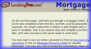
When investigating a mortgage, we went to two
prominently advertised sites. Lending Tree, below, asks the
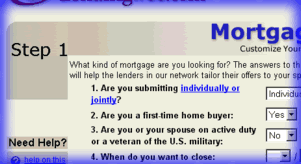
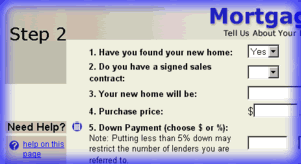
customer to complete a "simple four-step procedure"
before even showing any loan rates. It turns out to be a lengthy
series of panels to actually begin a loan application, not just
investigate rates!

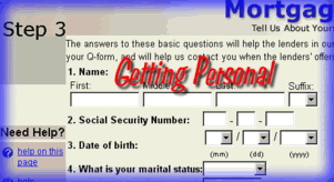
Notice on the next page, the information started
getting personal. That's when we bailed, before we even got
to the final step.
After
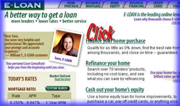
As if rebuilt by a web commerce Albert Einstein,
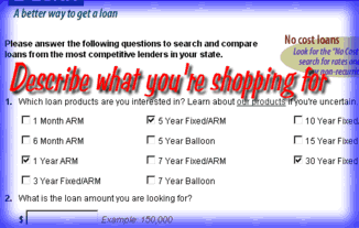
E-Loan, below, offers the web at its best. Click on a link,
put in a few items to describe the loan you're looking for and
it does the rest.
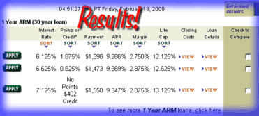
Below, it presents a brilliant snapshot of the
best loan rates in every structure, and lays it at your feet...
fully-cross-linked, backed by details and a glossary, and enabled
with near-spreadsheet power for scenario twisting. If you're
compelled by "good code" you'll be hooked right away.
The moral of the story? Don't make users jump
through hoops before giving them the real payoff of the web---
rich information. Base your product offering on that information
and you've got it made. That's the whole story.
We're available to help you apply these rules
to your system, whether it's a web site, client-server, or embedded
application. Just e-mail
us.
|