|
|
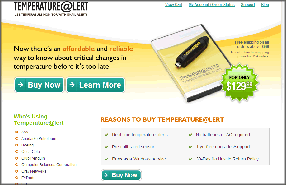
Congratulations! This is a free usability
review from UsabilityInstitute.com. "Usability" refers
to how easy and effective it is to use a Web site. Although
it involves how a site looks (graphic artwork), it is primarily
concerned with how a site works, what you click on, what happens,
and whether the site does its job. Perhaps
this review is all you need to improve your site. If that's
the case, great. Please mention UsabilityInstitute.com if
you talk with others who need help with their site.
The following three sections provide a general
analysis of your website from a relatively quick review. Although
Web design is still perceived as a highly creative endeavor,
there are many aspects of it that call for standardization
and compliance with widely established conventions. Implementing
even a few of the ideas below can really improve a site.
 |
|
|
This
first section is intended for typical public web sites
(for products and corporate information), but also applies
for the most part to intranets and software applications
that run in a browser. We've been advocating many of
these ideas—in the context of general software—since
our 1997 book,
Computers Stink, but they've been beautifully
enumerated for WWW purposes in Steve Krug's book, "Don't
Make Me Think." |
| |
|
|
 Click
for explanation Click
for explanation |
      |
 Hover
for explanation Hover
for explanation |
Comments |
| |
|
1. |
Logo
in top left, linked to home |
 |
The support pages
are a site to themself, so they don't link back, but that's
their choice. |
| |
|
2. |
Tagline |
|
"USB temp alert
with notif's"... everyone should do it so easily! |
| |
|
3. |
Welcome
blurb |
|
"...
know about critical temperature changes" and the "reasons
to buy" basically do it. |
| |
|
4. |
Plain
wording |
|
The Learn More page
has a great, straightforward explanation. |
| |
|
5. |
No
'happy talk' |
|
I didn't see 'leveraging
our core competencies" anywhere. |
| |
|
6. |
Concise
wording |
|
|
| |
|
7. |
Visited
pages are distinguished by link color-coding |
|
This
might be an area for slight improvement. The site has a
very strong color scheme and the links are colored to support
it. Although there are not a large number of pages, the
search results do start to show a number of products (weathergoose?)...
and knowing which ones were visited might help, but only
a little since the names are very distinctive. I'm not
sure if I'd want to go to blue/purple if I were the designer...
maybe my idea of using black-underlined for visited links
would work. They can still use green for unvisited, to
match the color scheme. |
| |
|
8. |
"Utilities" are
easy to find |
|
Nice
touch, too... status of cart right on every page: "(Your
shopping cart contains 1 item priced at $129.99)." Oops...
later I noticed "Help" at the bottom... so there's some
global navigation just at the bottom. This actually is
understandable in that it unclutters the product emphasis
at the top, but it is atypical, so worth more study. |
| |
|
9. |
Search
on all pages, with box and button |
|
Hmmm. The site starts
off appearing extremely simple... seemingly one product.
But clicking "Browse for more...." brings up a page formatted
as search results. Not sure but looks like the label and
presentation should present that page as "Browse All Products"
since there is no "Search Criteria" page or box. You could
say that the site doesn't need a Search box/facility, but
users don't know there are only 12 pages... they still
might value searching if only to prove that "thermocouples"
are not part of the product line. |
| |
|
10. |
"You
Are Here" indicator |
|
The initial impression
is that this would be unnecessary, but the bottom links
indicate that there is more to the site than initially
meets the eye. |
| |
|
11. |
Breadcrumbs'
as links |
|
There's
actually some breadcrumbs ("Home > Accessories > ")
but I'm not sure they're worth it since there's not much
depth. |
| |
|
|
|
Do your hands ache after a day at the keyboard??? Now in its
4th printing.
This review sponsored by RSIRescue.com ... 
If you've made it this far, I have a free
gift for the first 100 visitors who
reply. If you know anyone who's learning to read, email
me and I'll send you a free copy of a kid's book
I wrote. Please include "Poopy
Phonics" in the subject line so I have a chance
of recovering it if it goes to my spam folder. For
smart mouths everywhere, the book is PoopyPhonics(.com). No
strings attached, but if you like it, consider posting
a review to Amazon.com. —Thanks, Jack
|
|
— Privacy Policy:
No spam, no emails, no private info given out —
|
Summation & Next Steps
Overall Rating: Strives
/ Survives
/ Thrives
Summary and Recommendations:
Great site that supports its main product with clean, professional
art and does the basics very well. Navigation among product
details is the main area for improvement. I did not study the
shopping cart.
- Make a conventional site map.
- Reconsider global navigation possibly at the top.
- Look at whether the product navigation and page names could
be more consistent.
- Make the visited links the same color as the body text
(rather than standard purple which would fight the color
scheme).
Hope this helps and let
me know what you think,
Jack Bellis, UsabilityInstitute.com
|