|
|
Congratulations! This is a free usability
review from UsabilityInstitute.com. "Usability" refers
to how easy and effective it is to use a Web site. Although
it involves how a site looks (graphic artwork), it is primarily
concerned with how a site works, what you click on, what happens,
and whether the site does its job.
- Perhaps
this review is all you need to improve your site. If that's
the case, great. Please mention UsabilityInstitute.com if
you talk with others who need help with their site. (Bookmark
this site)
- On the other hand, if you would like to put some of these
recommendations into action on your site, or get a more detailed
analysis, contact us.
The following three sections provide a general
analysis of your website from a relatively quick review. Although
Web design is still perceived as a highly creative endeavor,
there are many aspects of it that call for standardization
and compliance with widely established conventions. Implementing
even a few of the ideas below can really improve a site.
 |
|
|
This
first section is intended for typical public web sites
(for products and corporate information), but also applies
for the most part to intranets and software applications
that run in a browser. We've been advocating many of
these ideas—in the context of general software—since
our 1997 book,
Computers Stink, but they've been beautifully
enumerated for WWW purposes in Steve Krug's book, "Don't
Make Me Think." |
| |
|
|
 Click
for explanation Click
for explanation |
      |
 Hover
for explanation Hover
for explanation |
Comments |
| |
|
1. |
Logo
in top left, linked to home |
 |
There but not linked.
Site uses common right-side placement of Home link but
I disagree with this and believe that time will unequivocally
side with me. |
| |
|
2. |
Tagline |
|
Not really. "The
Cult of Creation" and "Design Solutions," though arguably
taglines are not unique or sucessful enough. I'm not suggesting
I'm an "ad copy" guy, but it needs something like "World
Class, Global Standard Industrial Design." |
| |
|
3. |
Welcome
blurb |
|
No.
Move the mission statement to the top of the page and edit
it a little. |
| |
|
4. |
Plain
wording |
|
Yes. I didn't spot
any designer's jargon. |
| |
|
5. |
No
'happy talk' |
|
Yes. Site is text-sparse,
with English not being the primary language. |
| |
|
6. |
Concise
wording |
|
Yes.
Same as above comment. |
| |
|
7. |
Visited
pages are distinguished by link color-coding |
|
Yes. |
| |
|
8. |
"Utilities" are
easy to find |
|
Yes,
but trivial... Home, Contact, Feedback. |
| |
|
9. |
Search
on all pages, with box and button |
|
No. |
| |
|
10. |
"You
Are Here" indicator |
|
OK... the top level
nav indicates area by color-coding the tab's bottom edge. |
| |
|
11. |
Breadcrumbs'
as links |
|
No.
(Then later, spotted them on just one area.) |
| |
|
|
|
 |
|
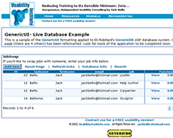
Students and Professional Developers:
Designing a serious software application in a
browser? Don't spend time and money designing the look
and styles... there's more than you think involved!
Instead, use GenericUI,
shareware CSS and artwork that's free for non-commercial
use and indefinite trial use.
|
Do your hands ache after a day at the keyboard??? This review
sponsored by... 
Summation & Next Steps
Overall Rating: Strives
/ Survives
/ Thrives
Remember this is a superficial review, so for fundamentally sound sites, it
tends to be a little forgiving since I don't dig very deeply into genuine user
experiences. The following are NOT in priority order.
- Find five other industrial design sights
and note the color palettes. Apply one. There are ten billion
websites; don't obsess over the possibility that you'll invent
a new color pallete.
- Change "About Pune" to "About Pune India."
- Eliminate references to "Cult" as in cult of creation.
For an American audience, "cult" has a negative connotation
implying excessive behavior.
- Change "Graphix" to "Graphics" unless there's a reason.
- Remove the Design Solutions graphic from the home page,
or make it a main theme.
- Eliminate the table borders on the graphics on the home
page. Find an elegant model of product shots and mimic its
borders and backgrounds.
- If targeting English-speaking clientele, have a native
edit all text.
- There's enough good content but the site needs a lot of
UI touch-up work: simple text editing throughout to overcome
the language differences; end-to-end reevaluation
of the links below the main level, separating recurring links
from unique ones; standardization and improvement of layout
(tables, borders, colors, backgrounds, image sizes and edges)
techniques. This work does not have to be very creative...
these elements have been solved on many other pages. When
in doubt use a white background and NO other design elements.
Hope this helps and let
me know what you think,
Jack Bellis, UsabilityInstitute.com
|