|
|
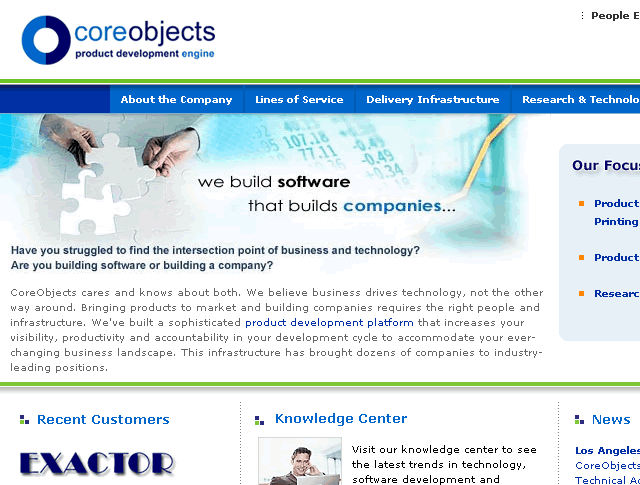
This is a quick usabilty review of CoreObjects.com, a website
for software development services.
 Larger
Image Larger
Image
Congratulations! This is a free usability
review from UsabilityInstitute.com. "Usability" refers
to how easy and effective it is to use a Web site. Although
it involves how a site looks (graphic artwork), it is primarily
concerned with how a site works, what you click on, what happens,
and whether the site does its job. Perhaps
this review is all you need to improve your site. If that's
the case, great. Please mention UsabilityInstitute.com if
you talk with others who need help with their site.
The following three sections provide a general
analysis of your website from a relatively quick review. Although
Web design is still perceived as a highly creative endeavor,
there are many aspects of it that call for standardization
and compliance with widely established conventions. Implementing
even a few of the ideas below can really improve a site.
 |
|
|
This
first section is intended for typical public web sites
(for products and corporate information), but also applies
for the most part to intranets and software applications
that run in a browser. We've been advocating many of
these ideas—in the context of general software—since
our 1997 book,
Computers Stink, but they've been beautifully
enumerated for WWW purposes in Steve Krug's book, "Don't
Make Me Think." |
| |
|
|
 Click
for explanation Click
for explanation |
      |
 Hover
for explanation Hover
for explanation |
Comments |
| |
|
1. |
Logo
in top left, linked to home |
 |
Yes |
| |
|
2. |
Tagline |
|
We build software
that builds companies. |
| |
|
3. |
Welcome
blurb |
|
Not
exactly. Skips past any blunt explanation of what the
company excels at and goes right into their philosophy...
seeming to skip the
specific
differetiation
between their offering and others'. It's there, but it
takes a little bit too much effort. Is the driving direction
the Product Development Platform???
Maybe it can be found in here: "...They provide an
intelligent mix of expert offshore development resources
to deliver
significant savings, while also placing engineers in
our offices to effectively manage communications and
optimize process efficiency." |
| |
|
4. |
Plain
wording |
|
Yes with some exceptions>
CUP is in the secondary navigation. |
| |
|
5. |
No
'happy talk' |
|
Maybe just a little
too much. With such intense competition, consider this
sentence
on the home page: "Visit our knowledge center to see
the latest trends in technology." Maybe it should
just be a headline and two meaty trends? And the Core Culture
section starts to get trite. |
| |
|
6. |
Concise
wording |
|
Very
slightly too much text per page as you start digging down.
Vistors would have to be fairly dedicated IT readers to
want to
read
8 paragraphs
per page for the practice philosophy pages. |
| |
|
7. |
Visited
pages are distinguished by link color-coding |
|
No.
This is turning out to be one of the most consistently
difficult items to satisfy because it conflicts with the
aesthetic design. I think on a sitel like CoreObjects,
it might be somewhat important, as a prospective visitor
could be trying to simply browse the site to get a full
understanding of the company. Maybe the solution is to
change the visited color just slightly toward purple. |
| |
|
8. |
"Utilities" are
easy to find |
|
Contact
Us is in upper right. |
| |
|
9. |
Search
on all pages, with box and button |
|
|
| |
|
10. |
"You
Are Here" indicator |
|
Yes, double-arrow
on subpages. |
| |
|
11. |
Breadcrumbs'
as links |
|
No
but not a deep enough site to consider as an omission. |
| |
|
|
|
 |
|
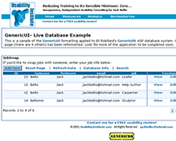
Students and Professional Developers:
Designing a serious software application in a
browser? Don't spend time and money designing the look
and styles... there's more than you think involved!
Instead, use GenericUI,
shareware CSS and artwork that's free for non-commercial
use and indefinite trial use.
|
Do your hands ache after a day at the keyboard??? This review
sponsored by RSIRescue.com ... 
Summation & Next Steps
Overall Rating: Strives
/ Survives
/ Thrives
CoreObjects is a highly
professional and attractive site. Its challenges and limiting
factors lie not in usability
but in areas of marketing, copy writing,
graphics, and creating more compelling content. I'm not a marketing guy,
but I'll offer my thoughts. In terms of usability, yes it
has a few flaws (site map, search, visited-link color
coding) but these are all
"compliance" and convenience type issues, not structural
or conceptual impediments that make the site ineffective to use.
One reads a few pages and gets the idea.
Recommendations:
- The first question is, what is CO's differentiator...
foundational code, onsite project leaders... perfected
methodology??? This needs to
"float to the top" (the home page?) better... and
perhaps look like a theme on other
pages. Is "productizing product development" the strongest theme?
Maybe accountability is a huge differentiator to focus on.
- Exploit and promote the presentation of key
successes, such as Stamps.com. Although the home page has
some Recent Customer links, the high profile Stamsp.com is
buried. Consider replacing one of the testimonials with a
prominent
Case Study
box. And make the Recent Customers links go to your own page
that profiles the success stories in 1/3 of a page each,
with bullet items. Only take the visitor to the customer
site from that page.
- I feel that on a very wordy site like this
each page, or most of them, should have an anchor graphic...
one
that
marks
the
page
in
the visitor's
mind. Eliminate the repetitive graphic of the man in gray.
The flowchart and architectural graphics have potential.
Improve them to make the text legible. Make sure most of
the message
pages have a graphic above the fold. Putting them at slightly
different spots is a design choice.
- Perhaps make better
use of callouts... larger text in a block, and even bullet
items
to replace a few paragraphs.
- People Excellence is cliche. Perhaps change
it to Core People and rethink the secondary navigation
that says Core People.
Hope this helps and let
me know what you think,
Jack Bellis, UsabilityInstitute.com
|