|
|

Before-and-After: Bret Victor's "Magic Ink"
If you fully design the graphics, interaction
design is not necessary!? April 24, 2007 |
 |
Synopsis: This B&A
is right out of the pages—with permission—of Bret
Victor's landmark article, "Magic
Ink, Information Software and the Graphical Interface." In
it he shows how informational software design, when elevated
to its fully mature state, provides information of such
value that users hardly have to navigate at all.
In my Morsels page, I
recently explained the remarkable ideas in Bret's Magic Ink
article. It's been several weeks now and I've finally finished reading this 70-some page dissertation. It is, hands-down, the most important thing I've read in 24 years of software work (since making a graphics program in '83). Now maybe that's because I haven't read some of the biggies, but I've been reading UI stuff almost every lunchtime for years. Most of what I read makes perfect sense, but in a very mundane nuts-and-bolts sense. We all know that the inmates run the asylum. Tell me something new.
Bret has something new: interaction design has somehow become the fixation of current interface design, and in so doing has stunted the growth of informational graphics. In Magic Ink he lays out his epiphany in the course of designing a new (MAC) widget to plan subway trips on BART. The thesis has two halves: 1) designing better graphics, and 2) revolutionizing software and its society to facilitate automation of those better graphics. The second half left me in the dust, as Bret clearly is reaching new levels of abstraction, but the foundation of the building is no less remarkable despite its lofty heights. We learn by the end that technology continues to double what it can afford us, but somehow we satisfy ourselves on very incomplete graphics.
A major and probably controversial theme of Magic Ink is that
'context' should drive increasing value into graphics, obviating
the need for all this clicking—hence interaction design—of
which we are so enamored. By context he means more and smarter
software inputs to displayed information... everything from
cross-application data sharing... to hardware (time/geopositioning)
inputs... to stuff that some would say is wild-and-crazy or
intrusive AI stuff. For instance a web search for restaurants
should infer from your recently received email (in which a
friend asked about going out for pizza) that you want to see
pizzerias. I'll leave it to the reader to make the call on
whether the thesis as a whole is hair-brained or genius. I'll
simply attest that the graphics should be required reading
for all of the next generation of software designers.
In this B&A I'll present Bret's key before-and-after
examples and try to deconstruct the elements that deliver the
magic... elements we all might try to emulate.
It's worth emphasizing
that some of these are demonstrations, not all fully
implemented solutions. As such, they might not account
for all of
the design considerations that might be justified,
accessibility being a key example.
Before & After #1... Pointsettia and Click
This first image shows a simple evolution of UI design. On the left, the 'before' image is essentially unchanged since Douglas Englebart gave birth to a mouse (well you know what I mean).
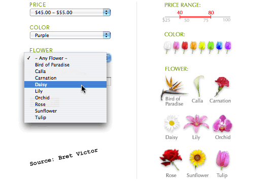
Although there might be some unfinished work to do to make this fully accessible, the principle shows through that the 'after' graphics go directly from the fingertips to the part of the brain that makes the decision. There's no side trip to the language parsing department.
- Show colors with colors.
- Show shapes with shapes.
- Show continuous ranges with a line.
- Show the full range/gamut, with the options in context.
When I posted this on my rant-of-the-day whiteboard, the first person to comment on it associated it with the dumbing down of society (and by inference the imminent downfall of civilization). Interesting, and perhaps sad... and an altogther too common reaction from folks in the technical world. Is it a foregone conclusion that a better interface implies anything about the role of education? I'll leave that as a student exercise for you to complete at home.
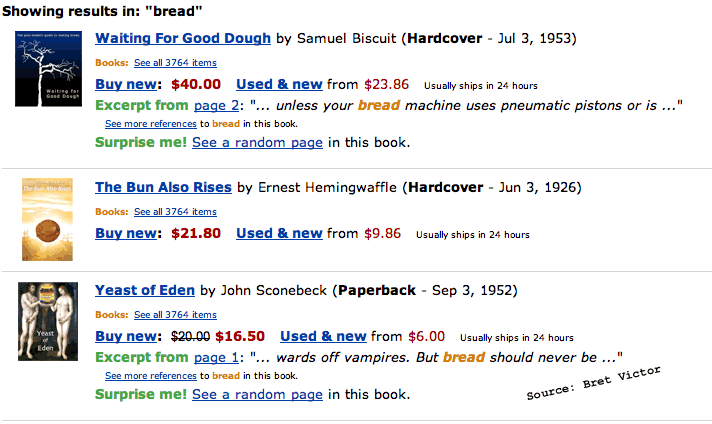
Showing the Full Story... Before
This sample shows a typical bookstore results list, but only half-baked:
After Across the street, in the land of enchanted visuals, is
this alternative: 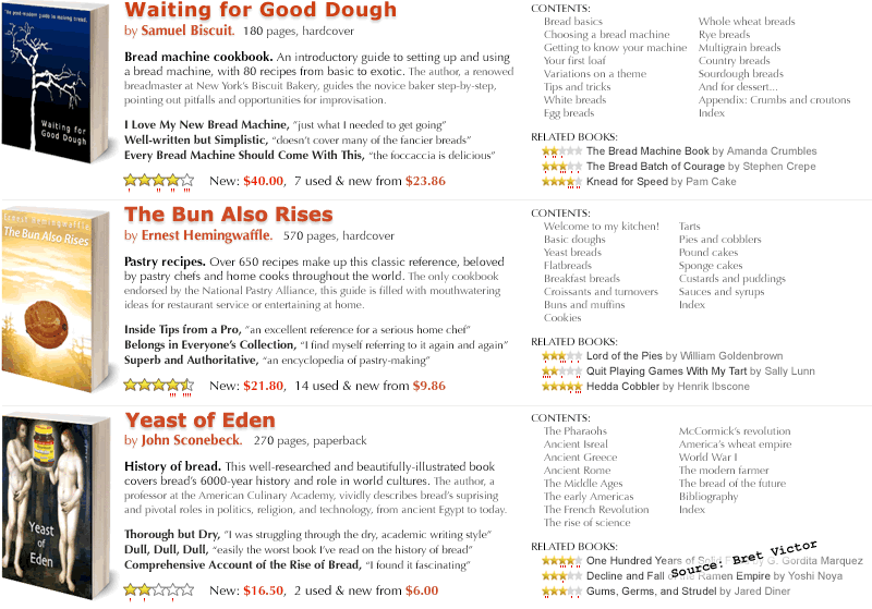
The differences run the gamut from philosophical to just
plain "artistic eye," but let's see if I can enumerate
the repeatable principles without reducing the exercise
to a list of "features":
- Graphics (the book covers) large enough for the imagery
- Graphical sophistication (perspective, shadow)
- Contrasting typographic weight and color
- "Visitor values" attended to instead of "vendor
values"
- Rich detail in the first view
- Key, substantive information in the first view
- 13 types of information, but aesthically balanced and
comfortably packaged; folks, don't try this at home without
a helmet and goggles.
Travel Planner... Before
Our next example shows a typical airline site... a vast array of seemingly helpful things to click on, followed by a chart. Both are marvels in their time, which was 1980-ish. The chart is rather sophisticated... usable even, compared to cave drawings, that is.
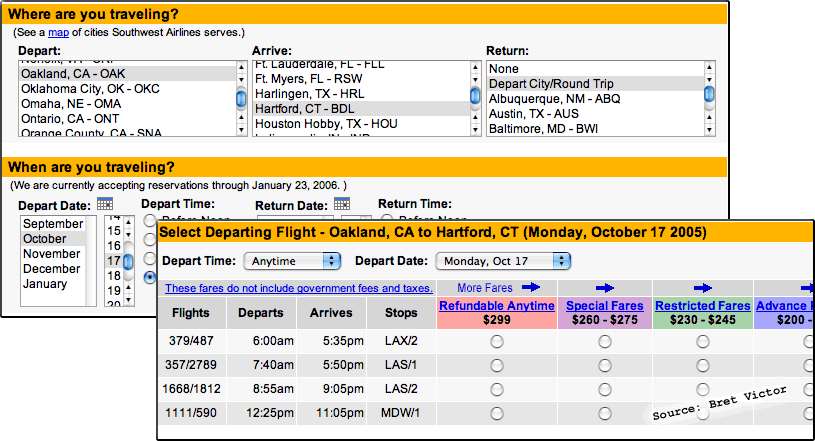
After
And in this corner, a whole new worldview.
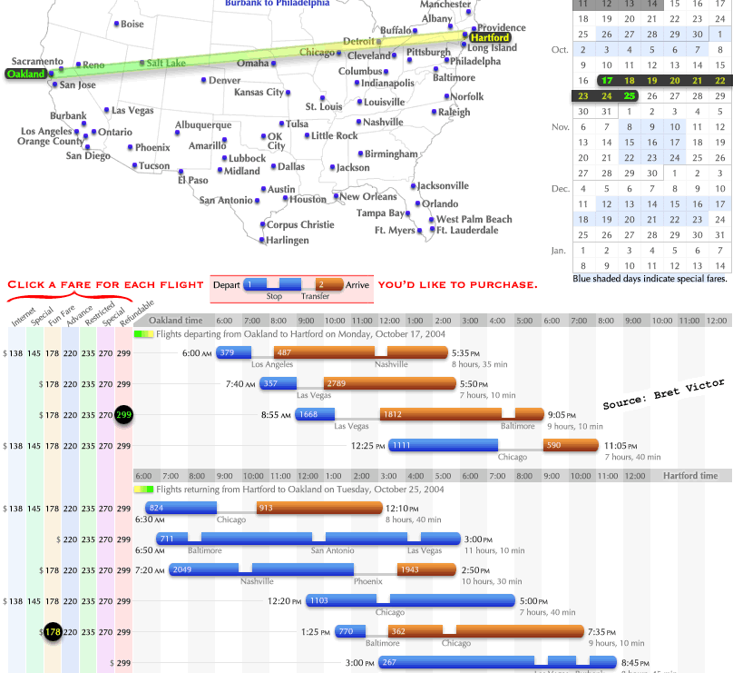
At this point the techniques start to really add up and it's not my intention to reiterate the author's thesis, so I'll refer you to Magic Ink for the details, but here's a start:
- Interaction and results on one page
- Interactions are minimized and direct
- Geographical locations are shown positionally
- The input (interaction) is also output (informational), meaning that the start and destination become a visible flight path... you know you haven't accidentally chosen Hartford to Boston.
- Every message is presented in the visual medium that most immediately depicts its significance. Time is shown horizontally. Entities are differentiated by color. Discontinuity is shown by gaps.
- One of my favorites: legends are shown in place.
I remember when I first told the owner of a character-based system that we should put 8 controls on the screen at the same time. This was perhaps 1992, just before Win 3.1 came out. (A character-based system had a black screen with green text on it, 80 across, 25 down. They typically had alphabetic menus and you could do some highlighting and selection with the spacebar, but no mouse.) He was aghast. Of course now, many web pages have 200 clickable regions (technically called 'windows' under the hood if I'm not mistaken). Bret's redesign above makes me recall this evolution in expectations about information density. As long as people can read it, the moral of the story is now "show me the info."
BART Planner... Before
OK, now for the pièce de résistance, Bret's redesign of the BART subway trip planner. In the 'before,' we see the usual suspects: separate input and results, text-heavy interactions, eye-glazing reportage:
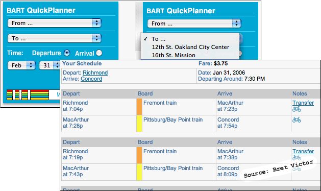
After
Here it is, the next 'n' years of information graphics:
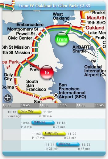
What's that you say... it doesn't seem so miraculous? Well, there's about 10 pages of features to explain, from simple graphical touches such as shading the past in a darker band, to the revolutionary prospect of defaulting almost everything based on context... the user's history, time, place, tastes, friends, workday, interests and so on. You should really view the QuickTime demo at http://worrydream.com/MagicInk/bart_widget_demo.html.
I'll wrap things up by showing just one more design aspect, a classic parameters page.
Parameter Settings... Before
In the Bart planner, the option of having voice announcements presents the following design challenge. Here's a typical screen for configuring such choices:
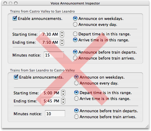
I must admit, for the last 15 years (yikes... since Win 3.1 in 1992!) I've thought this was the goal.
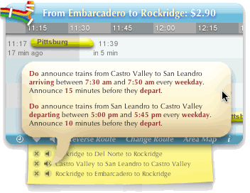
After
Below is the visionary—but most definitely real—redesign. In the spirit of Magic Ink, I'll add my own text only to mention that most of the keywords are clickable... otherwise I'll let the picture do the rest of the talking.
Thanks for reading. -jb
If you've made it this far, I have a free
gift for the first 10 visitors who
reply. If you know anyone who's learning
to read, email
me and I'll send you a free copy of
a kid's book I wrote that has just been
printed (February 14th, 2007). For smart
mouths everywhere, the book is PoopyPhonics(.com). No
strings attached, but if you like it, consider
posting a review to Amazon.com. Please
include "Poopy Phonics" in the
subject line so I have a chance of recovering
it if it goes to my spam folder. —Thanks,
Jack
—No spam, no emails,
no private info given out—
|
|
|
|