|
|
The New Web Aesthetic
Jack Bellis, September 23, 2006
Synopsis: For approximately two years now, a set of aesthetic conventions have somewhat firmly entrenched themselves into general web design. Just as newspapers have had a relatively standard set of rules for the color of the ink and paper, typography, spacing, alignment, and so on—and it's prevailed for hundreds of years—it was just a matter of time before we settled on the preferred look for web information.
Yes, newspaper aethetics have changed in the last few years, since the advent of color printing, USAToday, and the competitition from the web. But not all that much. They still use serif fonts, black ink for body text, light paper color, roughly the same headline conventions. My point is that certain basic choices are best for the job; it is not the case that change for the sake of novelty or freshness overrides the other factors.
And on the web, I propose that we have settled into a few aesthetic choices that will prevail for a long time. Some might change in the short term, and perhaps a ten-fold increase in display resolution (from the current 72dpi of current monitors to 600 or more of most print media) will restart the clock of change, but you might be surprised how long the new look will last. First let's see what I mean. Take a look at the following examples:
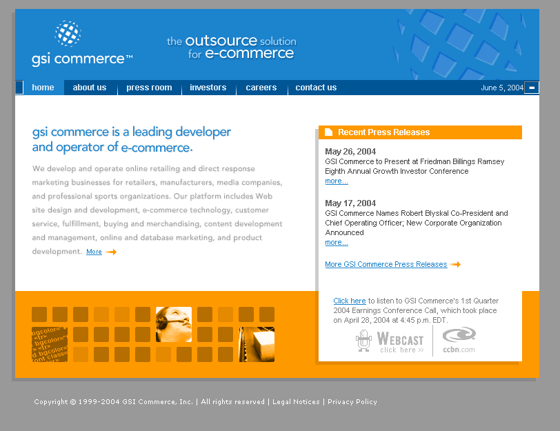
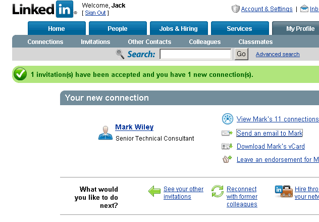 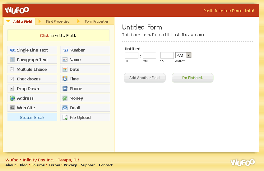
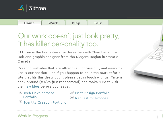
Here are the trends I see, though admittedly they're not common to every page:
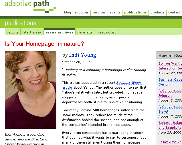
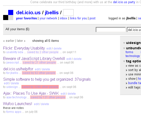
- Lighter gray text, not perfect black.
- Sans-serif fonts, fur shur, but Verdana/Tahoma has proved most likable. When data squeezing is needed, Arial.
- Widening the character spacing and line spacing a little seems to be getting more common... easier on the eyes, I think.
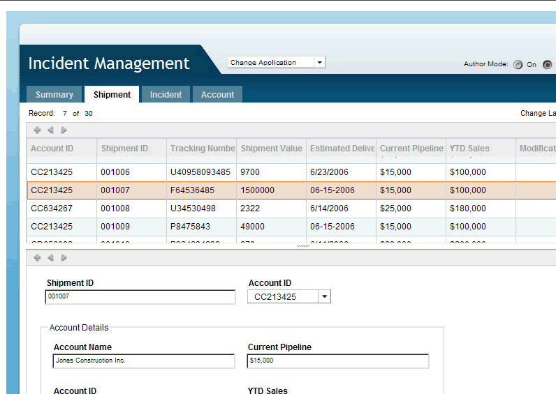
- White background for the working area. Nothing especially new here, but things have settled down for sure.
- Related to the white background is that of using white (or very light) as the color of the active tab, to flow into the page. This is one of Steve Krug's important rules for making tabs look like tabs.
- The white background is very often on a raised, centered panel. Sure, centering vs. left-aligning is an age-old battle and when you move from push (marketing pages) to pull (data/functionality pages), left-aligned, liquid layouts are the norm.
Aside: There's a fascinating design oddity in the 800-pixel-wide, centered panel. If I understand things correctly, modern monitors have a form factor of 4x3 because our eyes are side-by-side, so someone thought they should be proportioned accordingly. But now we have tens of b'millions (new word) of websites that have narrowed their pages, not just because of old monitors but because they've been advised that narrow column widths are easier to read, too. What a contradiction in progress! I loved using a portrait monitor years ago and will on occasion turn my CRT on its side and use a software pivot-er, to review long print docs.
- Don't fight the squares. With the possible exception of some button and tab corners, and header bars, curved shapes are just not being used that much. Now certainly, in the height of elegant artistic design, a page can achieve beauty by blending the areas of the page with continuous curves or other effects, but that's really a background, not foreground, matter.
See Also: Dissecting CSS Styles
Revisionist History
|